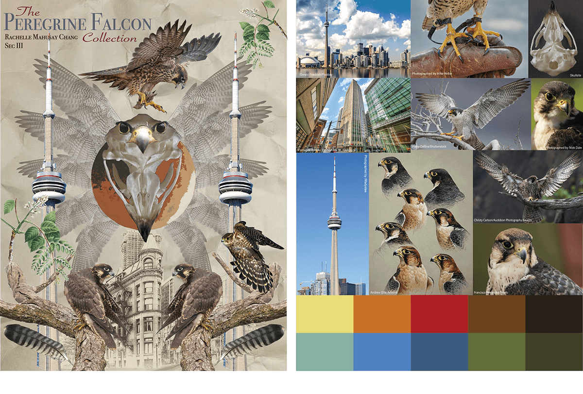
COLOUR & REPEAT DESIGN: THE PEREGRINE FALCON COLLECTION
Project by Rachelle Mahusay
Part 1: Research and Inspiration
The peregrine falcon is considered one of the fastest birds of prey worldwide. Peregrine falcons are uncommon in many areas of the world despite being found throughout six continents—excluding Antarctica. They typically reside near bodies of water. Peregrine falcons are roughly similar in size to crows and possess long, tapered wings. Their feathers are a mixture of brown, black and grey with a white collar; accents of yellow are on the base of the falcon’s beak, around its eyes and claws. In the mid-20th century, falcon populations were affected to a great extent by the agricultural use of pesticides and insecticides—such as DDT (dichlorodiphenyltrichloroethane); as a result, the species became gravely endangered. Thus, the falcon became a symbolic figure for the many threatened species affected by pollution. The birds are predominantly located in most southern cities bordering the Great Lakes in Ontario. They are of special concern and were added to the list of Species at Risk in Ontario on November 30th, 2011. In recent years, the peregrine falcon population has been stable in the province; however, they continue to be at risk due to environmental contaminants, habitat loss and destruction. Falcons commonly nest on cliffs in the wild; in Ontario, they have been observed nesting in and around Toronto, substituting cliff sides for building ledges.
I chose to research the peregrine falcon for this project because their stark appearance exudes such a powerful energy. After viewing pictures of falcons mid flight/dive, I think their silhouette would make for an interesting repeat design. I mainly want to play around with the shape, texture, and pattern of their wings, as well as the pop of yellow. Additionally, I’m planning to include elements of Toronto’s cityscape. I hope by combining artificial compositions with the more natural structure of the falcon, it would result in an interesting juxtaposition that would render well on screen and on fabric. If done correctly, I think the various elements can be translated into a compelling and visually vibrant design.
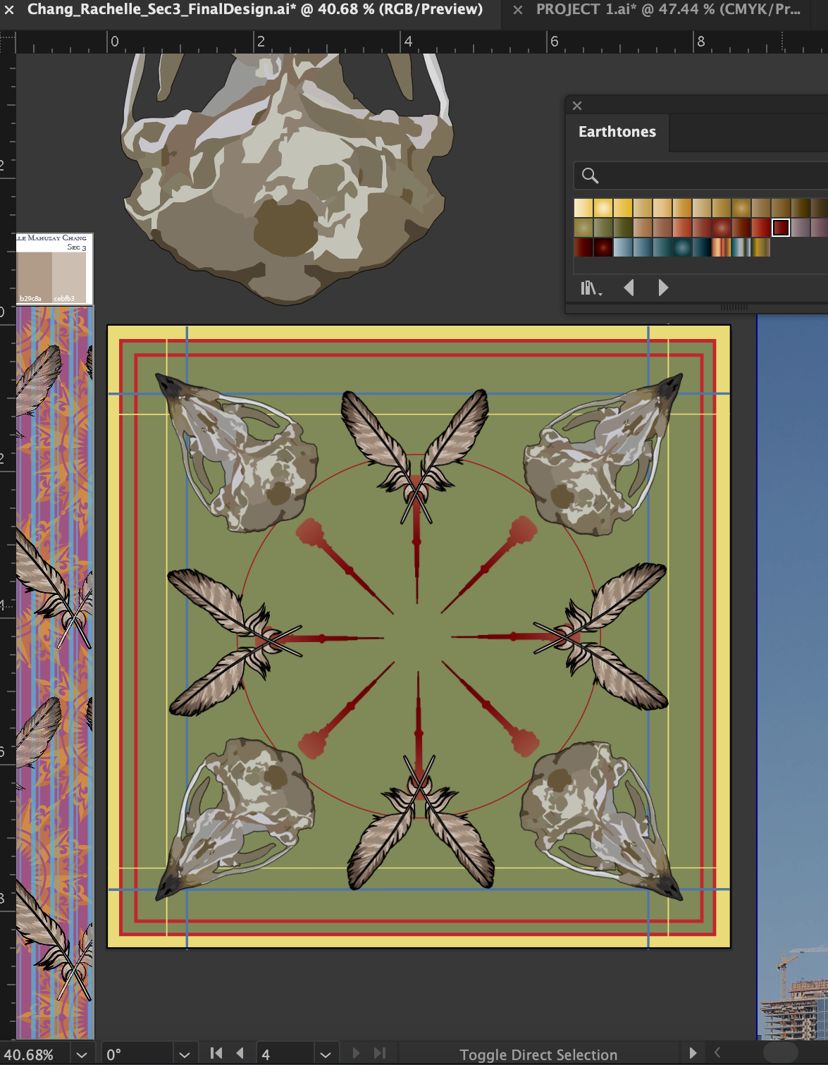
Mood Board & Storyboard
Images Used for Mood Board
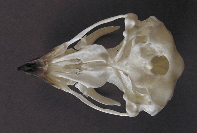
Motifs
Peregrine Falcon Skull

Peregrine Falcon Feather

Part 2: Repeat Designs
Original Colour Palette

Triadic Colour Palette

Part 3: Non-Directional Design
Process
I began my non-directional design by deciding how to arrange the colour palette from my mood board in an aesthetically pleasing way. Below is an example of one off my explorations. The blue against the red and yellow borders looked quite out of place; therefore, I changed the background colour to green to complement the red. Additionally I played around with the radial placement of my motifs to determine which pattern would work best for my intended design.

Once I cemented the placement of my motifs, I added silhouettes of the CN Tower to stay true to my original idea of incorporating elements of the city in my design. The CN Tower is in a radial placement to match the rest of my motifs.
I began adding circles of various sizes to fill up the empty background. Along the borders I incorporated a blue and orange chequered pattern to showcase aa vibrating boundaries colour scheme.
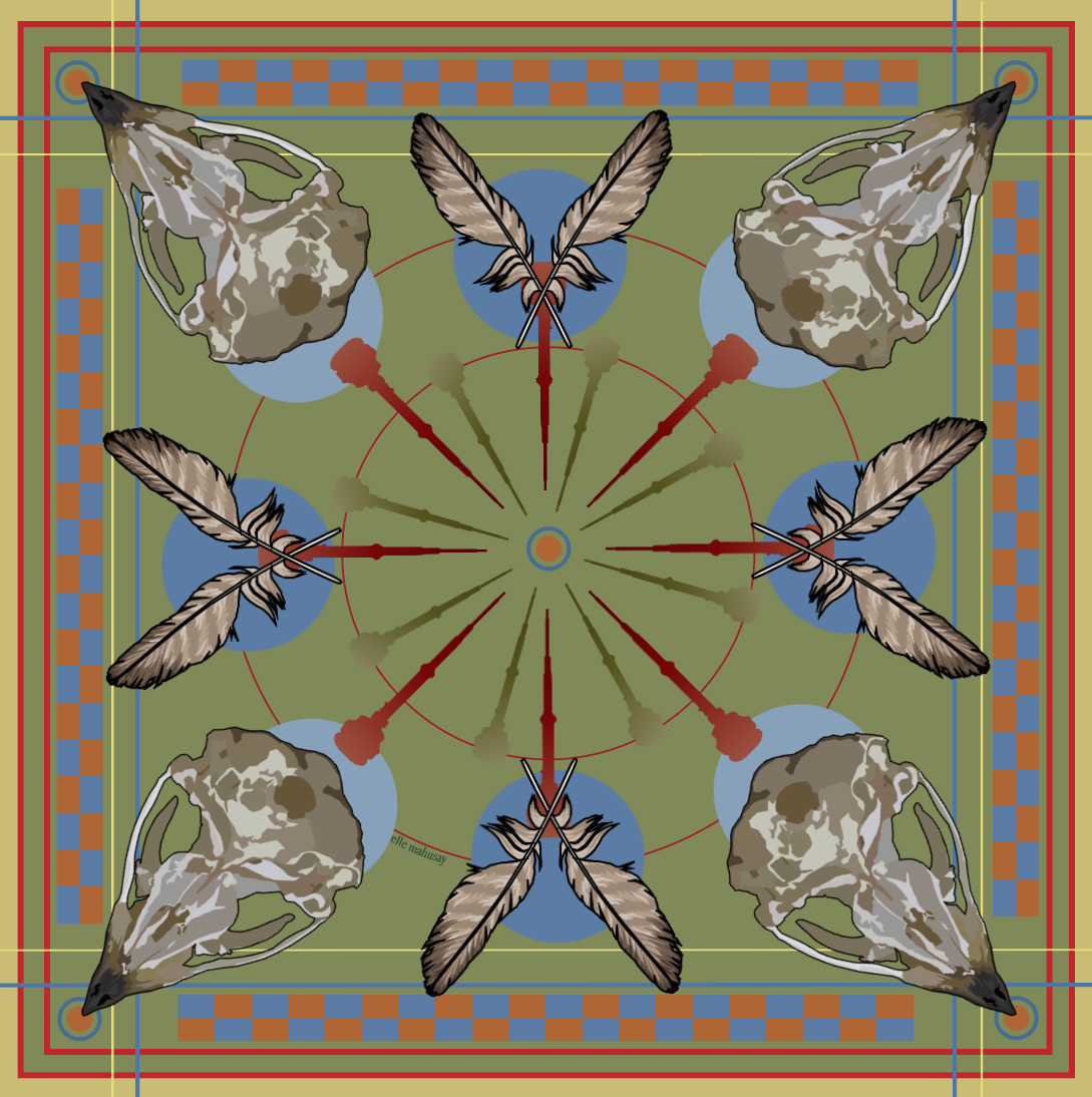
Final Design

Artist statement
The process of creating this project was quite enjoyable because I genuinely had fun utilizing Adobe Illustrator. As an artist that has grown comfortable with traditional art, moving onto the digital space hasn't been the easiest journey. Through trial and error, I’ve grown more comfortable using Illustrator during the past year and this project is a reflection of my growth. I decided to take a different route with my final non-directional design than what I had initially planned. Originally, I was going to make a full body motif of my chosen species: the peregrine falcon. Moving forward with that idea would've been predictable and simple; therefore, I chose to create a non-traditional motif. I broke down the anatomy of the bird and focused on showcasing its feathers and the structure of its skull. I created two falcon related motifs that I arranged in a radial pattern. Peregrine falcons are found throughout Toronto and they have adapted to nesting on tall buildings; to incorporate elements of the city and keeping with the radial theme, the silhouette of the CN Tower is displayed in the centre—I coloured the silhouettes using a gradient fill. I maintained an accurate colour scheme for the peregrine falcon motifs because I was aiming for a natural appearance. However, I stayed true to the colour palette from my mood board; throughout the design, I used muted green, yellow, red, blue and orange. I picked out the orange tones from the Andrew Ellis artwork I’ve included in my research; peregrine falcons have hints of brown in their feathers and using an orange tone instead of brown resulted in a more dynamic design. Orange is not a colour that I would normally gravitate towards but it translated well on the final product. Additionally, to create a vibrating boundary effect, I placed blue and orange beside one another. During the research process, I planned for my design to appeal to corporate employees by creating a luxurious pattern that can be used for luggages. I diverted from that plan and my final product became a psychedelic-esque design that I think would look great as an embroidered print on a handbag. Overall, I successfully translated the peregrine falcon into a non-directional design.
